The pain of two clicks
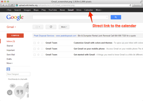
I’m an active user of Google apps and I spend much of my day inside of Gmail. I grew used to having a dark navbar at the top of the screen, containing direct links to other Google services, particularly Calendar.

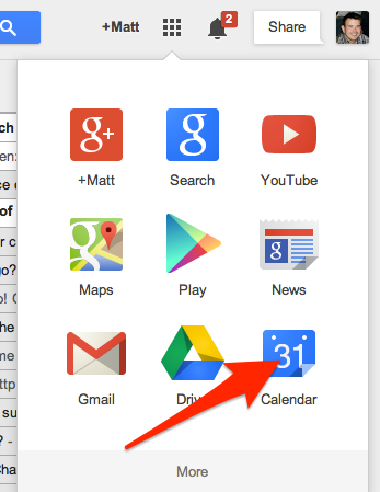
With a recent redesign, those links were placed in a drop-down identified only by a confusing grid icon. The Calendar link is placed in the bottom right of the app grid, beneath other, less-popular products (I’m not sure if this positioning varies between users).

For some reason, this change really frustrated me. I mean, it’s only an additional click right? There are variety of workarounds from bookmarks, to keeping my Calendar constantly open in a browser tab.
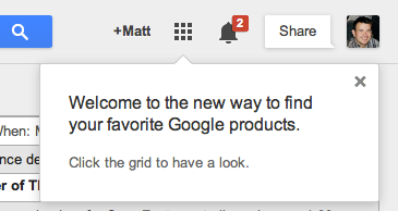
I think my frustration boils down to the way this change was messaged by Google:

Welcome to the new way to find your favorite Google products.
A casual reader might incorrectly assume that new implies more efficient, more convenient–a better experience for the end user. From what I can tell, all this change accomplishes is freeing up space for a large icon to be placed next to each Google product. Maybe there is some end-user benefit to associating logos/icons with products. If there is, I have yet to discover it. However, I can respect that there are trade-offs between design and usability.
Perhaps more frustrating is their use of the word favorite. Google+ is not one of my favorite Google products. The Google Play store isn’t particularly useful since I don’t own an Android device. And Google Search and YouTube? Chrome makes going to the Google homepage seem silly. In this context, favorite actually has no connection to my preferences–it’s a selection and ordering of products that match Google’s business objectives.
One extra click isn’t that big of a deal. I mean it requires maybe an extra second or two of work. But every time I have to make that extra click I’ll be reminded that Google makes changes that aren’t going to help me. And those clicks add up.
New posts delivered to your inbox.