Square Cash vs. Venmo
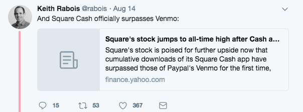
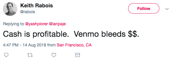
I recently saw these tweets by Keith Rabois:


Assuming this was investor hyperbole, I did some more digging and was surprised to learn that Square Cash is doing incredibly well. And since both services are offering physical cards I decided to request both and test them out.
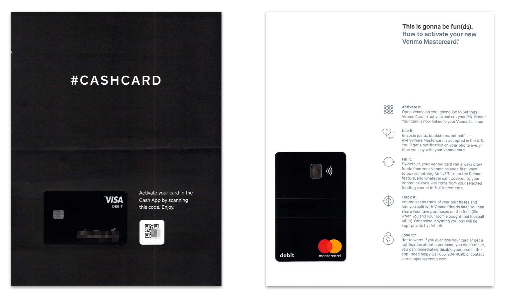
I received the two cards on the same day. Each envelope contained a debit card attached to a single sheet of paper. I scanned both sheets of paper side-by-side to highlight the stark contrast in approaches.
Square limits itself to 12 words to drive users to activate their card. Venmo uses a wall of text, and includes details around how to use the card, how to reload it, how to track usage, and even what to do if you lose it. The activation details are hidden in the first bullet.
Given the incredibly high cost of getting users to order a card, delivering the card, and the subsequent increase in customer LTV post-activation, high activation percentage (number of activated cards over number of cards mailed) has to be an critical metric.
The distinctly different approaches leave Venmo feeling more like a traditional bank, with Square Cash looking more like the upstart. Venmo has clever copy, but seems to miss the point of the mailer entirely. I could completely be missing a critical insight—for example, longer form copy could lead to higher activation rates—but that feels unlikely.
Venmo has had a huge head start. But Square Cash seems poised to continue to chew away market share.
New posts delivered to your inbox.
