Craigslist testing mobile and tablet versions
Hell hath frozen over. Craigslist started testing mobile and tablet-optimized formats of their website starting last week.
On account pages, you can see the following links at the bottom of the page:
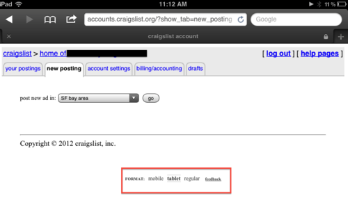
Clicking one of the options sets a cookie that dynamically modifies the page source whenever you visit a Craigslist page (this means that the classic version is visible briefly, before the elements are rearranged).
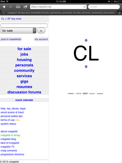
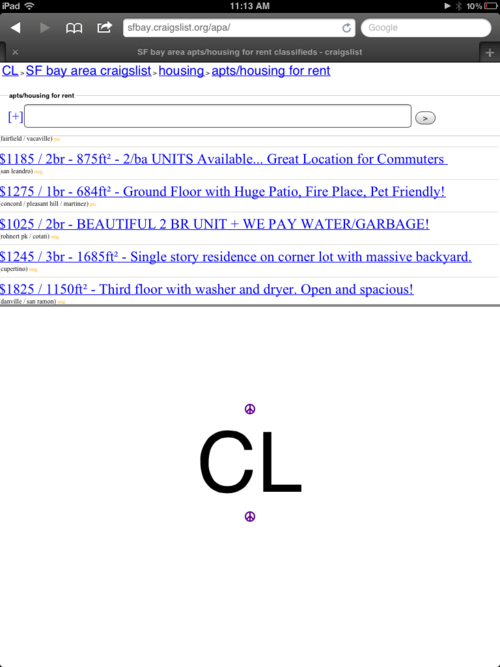
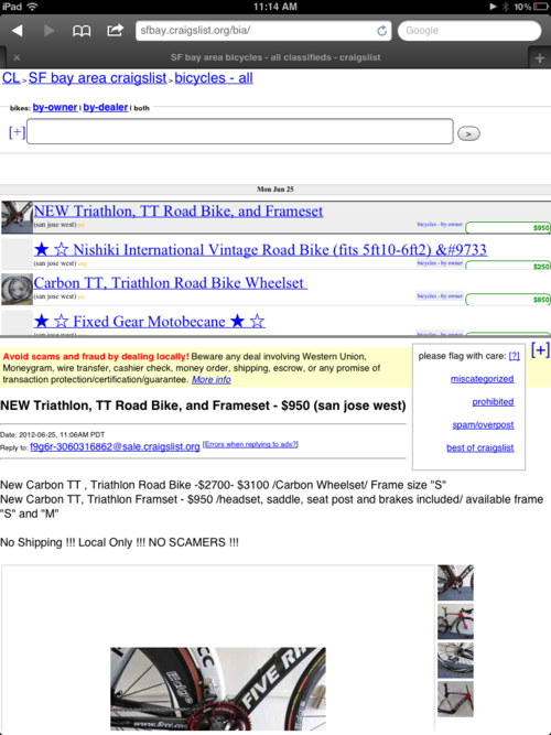
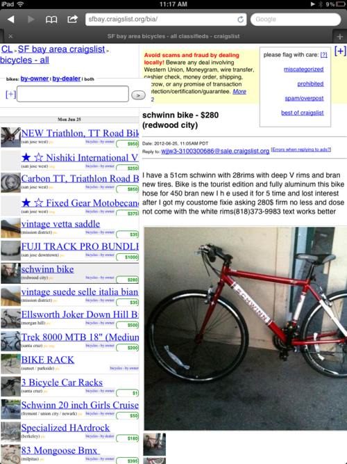
What’s the verdict? The mobile version actually looks pretty useful–more readable text-sizes, better layout and navigation on a small screen (scrollable images, etc.). However the tablet version is awful. They try to use panels to break out category navigation, search results and listings, and the result is pretty much unusable. Hopefully it will go through a couple more iterations as I could see it being very helpful going forward. I’d have to imagine that there is a pretty large contingent of Craigslist users who browse exclusively on mobile devices/tablets. If you have any feedback, be sure to let Craigslist know:
https://forums.craigslist.org/?forumID=8374.
And if you want to explore some more of the technical details, here’s the Javascript they’re using to modify the page source:
http://craigslist.org/js/formats.js
Now on to the screenshots…
Mobile Home Page
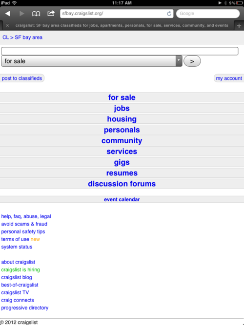
Mobile Search Results Page
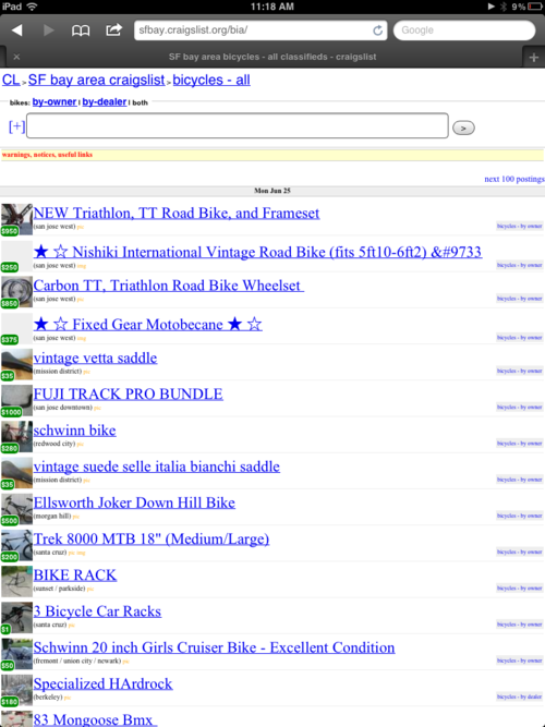
Mobile Listing Page (Inline in search results)
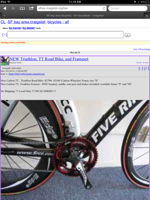
Tablet Homepage
Tablet Search Results Page (Only 5 listings visible at a time–hooray!)
Tablet Search Results Page (Ok, a little cooler when you’re actually looking at a listing)
Tablet Browsing (Portrait)
Tablet Optimized Posting Flow (sorry iPads, no pics)

New posts delivered to your inbox.